Case Study: Preparing for your ‘iternal’ life
UX/UI | A responsive website redesign to share your most precious memories securely with your loved ones

Executive Summary
Working in a team of 4, we collaborated with Iternal to redesign their website and mobile-web app. Iternal allows you to save and share your most precious memories securely with those you care most about. We focused on the homepage, onboarding and dashboard, to increase the conversion of visitors to the site to sign up and record their memories on the platform.
Duration: 3 week design sprint
Tools: Paper sketching, Project Planning in Trello, Digital prototyping and iterations in Figma, Whiteboarding, Design Studios in Miro and User Interviews over Zoom
Method and approach: Business Analysis, Competitive Analysis, Screener Survey, User Interviews, Usability Testing, Feature Prioritisation, Design Studio with the Client, Ideation and Usability Testing, Rapid Prototyping and Accessibility
My role: This was a collaborative project, with three other designers. We each conducted our own usability interviews, user testing and synthesised our results. I took the lead on all client communication, the project planning, the initial wireframes and took the ‘creating your memory’ onboarding from low fidelity all the way to final high fidelity prototype.
The brief
The client

Iternal was built in 2020 to help people capture their most personal memories and share them privately and securely with those they love. Unlike social media, the idea behind Iternal is to get people to ‘open up’ and leave a legacy that truly can be enjoyed for eternity. Their key user demographic are women aged 45–65.
The opportunity
We were asked to create a mobile-first design for their responsive web app, as their users are currently skewing more to mobile and tablet. The client asked us to help them to:
- Improve the onboarding process
- Maximise homepage conversion
- Improve the general UX of the platform
- Explore the idea of allowing users to create a memory before they have to sign up
The process
We worked with the double-diamond process, which included the following stages:

Discover: Who are Iternal’s competitors and customers and how do Iternal compare?
Current website evaluation
- Business Analytics
We initially analysed KPI’s shared by Iternal, which indicated immediately that although they have a lot of visitors to the site, not many people decide to sign up — only 6% in January, and 26% in February, and 11% of users created their first memory in January. We hoped to make improvements to the site in order to increase the number of first-time users and returning users.
2. Heuristic Evaluation

Next, we ran an heuristic evaluation of the site based on Nielsen’s 10 usability principles. This helped us to reveal insights of the current site shortcomings on fulfilling user’s needs and expectations. Our main findings were:
- An overwhelming number of call to action buttons to sign up on the homepage, 9 in total!
- The content was unclear, leaving the product offering undefined
- The value of the product was missing, meaning users did not know what to expect
3. Usability Testing
We next ran user testing on the existing site with 5 people. Our key findings were:
- Users were navigated to sign up, but unsure what was to be expected
- The process of creating the first memory was overly complicated
- Users were often led to an empty dashboard, with no clear prioritisation of content and the timeline feature (one of the USPs) was hidden in a menu
Although the dashboard was not in our initial scope, we decided as a group at this stage to include this as improving it would have a positive impact on the users’ experience.
Competitor Analysis
To understand Iternal’s market landscape, we completed an analysis of their direct and indirect competitors.
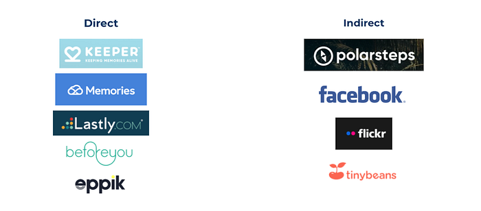
The key features which consistently came up across the competitors were:
- The homepage showed a clear offering of the product
- There was a step-by-step guide of how to use the product
- Visual timelines were used often, showcasing information in interesting ways
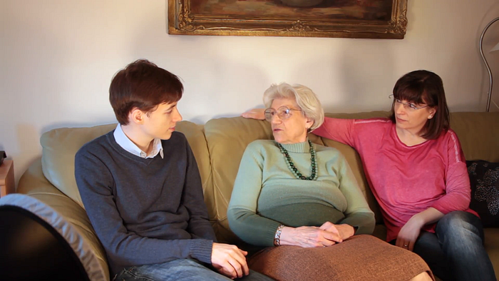
User interviews
Finally, we needed to find out more about who our potential user was, what their thoughts on preserving memories were, how they store their memories and how they share them, if they do at all! We surveyed 52 people, and contacted 15 for in depth interviews. Our interviews was with our target demographic 47–70 year olds.
We distilled our findings through an affinity map, placing all our insights on a digital whiteboard, and identified trends, patterns and themes.

We found our potential users:
- Love to share pictures and stories of the past with loved ones to build a connection
- Share pictures using technology e.g. via Whatsapp
- Struggle with organisation of the quantity of photos taken and received by others
Define: What problem are we trying to solve?
Customer Journey Map
I took the lead on creating the customer journey map for the existing site. I walked through the journey as an existing user to understand the areas of friction.

The main pain points were in two key areas:
- The homepage offering was unclear.
- The process of recording your first memory was confusing and overly complicated, eventually leading the user to an empty dashboard.
Our Persona Family
Personas help designers to create understanding and empathy with the end users. For Iternal, we created our Persona, Sarah Winters. Sarah has just turned 50. Her mother, Grandma Maggie is in her 70s, and her son is 16.
We focused on Sarah as our primary persona for this project:

Based on Sarah’s needs and frustrations she is facing, we created a problem statement to clearly define her situation:
Sarah needs a way to organise all her family stories and pictures securely in one place in order for all her family to access easily.
Because her family is very important to her and she wants to preserve her family traditions, stories and pictures.
Next, we created a user flow to visualise the steps needed by the user when using the new Iternal website. We focus on the ‘happy path’ to show Sarah’s steps to onboard and creating her first memory.

Develop: Developing ideas to solve the problem

We moved onto the Develop phase to create new ideas on how to improve Sarah’s experience. We developed 4 ‘How Might We’ statements i.e. questions that would help us develop solutions for her problem:
- How might we help Sarah document the past stories of her family?
- How might we show to Sarah the value of keeping family content online?
- How might we make it easier for the customer to create their first memory?
- How might we make sure all generations in Sarah’s family have easy access to the family photo albums?
We ran a successful Design Studio, a space where people create and discuss ideas through sketching, with 3 client members, including the Iternal co-founder.

This was a great experience, there was good collaboration between client team and designers. As a group, we shared interesting feature ideas which we took forward. The client team loved the Design Studio experience so much, that they are planning to incorporate this process in their Business As Usual (BAU) activities!
“We loved it, it was such a cool session…we will be doing it again in the future”
Paul, Iternal Co-Founder
These ideas were mapped onto a feature analysis axis, prioritising which were essential to implement and low enough effort to build in our short time frame.
The key features were:

Deliver: Designs based on user testing, iterations and user insights
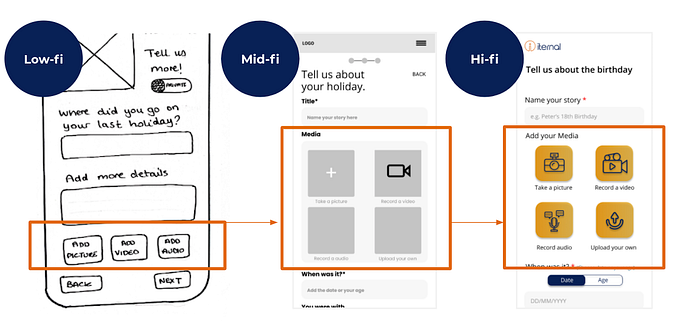
Finally, we moved into designing based on the findings from the Define and Develop phases. We started with paper sketches, iterated to mid-fidelity wireframes and ended with our high-fidelity prototype.
This involved a lot of user testing on existing and new users of Iternal, which was followed by iterations based on feedback.

Key Iteration 1: Onboarding User flow
Our first key challenge was where to onboard our user. In the brief, Iternal asked us to explore the concept of users creating their first memory before they sign up. Effectively giving users a ‘try before you buy’ incentive.
- In low-fi, tested 5 users, they felt frustrated, by investing time inputting information and pictures and then being asked to sign up. Users said they felt “manipulated,” and they felt their “hands were tied to sign up.”
- In mid-fi, we included 3 onboarding screens between the homepage and the sign up page, leaving the memory creation to after signing up. However, after testing on 7 users, it was clear that these pages were redundant, users said the “message was repeated” from the homepage.
- In hi-fi, the extra onboarding screens were scrapped, and a clear ‘how it works’ section was added to the homepage. We also included visualisation of their key feature, the timeline, upfront so users knew what they were signing up for, which users understood and liked.

Key Iteration 2: Homepage Clarity of Offering
It was important that the user was able to understand the product offering in the homepage. We wanted to include an easy to understand step-by-step guide to help users understand the product and its value.
Our users said:
“I would want to know what this is all about first, I would need to read this page through before I sign up”
“I like being able to see the timeline feature upfront, this is the unique selling point”
We iterated from a combination of features and steps in low-fi, which users found was not enough information, to iconography and some copy in mid-fi, to clear custom made illustrations and easy to understand copy in hi-fi.

Key Iteration 3: Picture First
In our user interviews and testing, users wanted to organise their memories through pictures, and add stories to compliment them after. In order to make this step easier for our users, we iterated to have clear iconography at the top of your ‘create your memory’ page, to prompt users to upload their media first.
In testing, our users said:
“I like the ease of it”
“I like first being able to add a photo, it helps with jogging my memory about the details”
Key Iteration 4: Dashboard
Although the dashboard was not in our original brief, we decided to take it on in order to complete the user onboarding journey. We focused on the overall functionality, structure and accessibility.
As a reminder, Iternal’s current dashboard can be seen below:
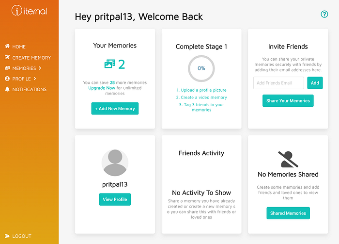
Using ideas from the design studio, we developed a structured dashboard, with clear prioritisation, and an intuitive layout. Key features such as the timeline, family tree and message to the future are now easily accessible to the user, with clear visual representation.
Our users said in testing:
“I really like the family tree, can I click into it? I would love to collaborate with my family with this”
An example of our iteration was the call to action buttons:
- Creating a new memory was the primary call to action at the top of the dashboard in the low and mid-fi.
- In the hi-fi prototype, this was reprioritised to match other call to action buttons for all other features, which made more sense to users.

Ensuring accessibility in our visual design
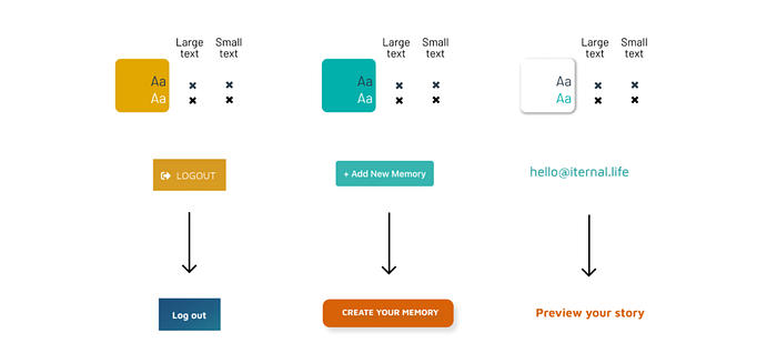
Our research showed that Iternal’s appeal was to a wide user demographic, but skewed towards an older user. This meant that we would need to ensure accessibility to users with visual and/or physical impairments which can worsen with age. Iternal’s current visual design did not meet usability standards. I have a great interest in inclusive design, so I wanted the solution to be usable by all, regardless of age, abilities or circumstances. This included:
- All typography was larger than standard for easy reading
- Making action buttons have large clickable areas for those with physical ailments
- Ensuring our use of colour was fully accessible using sufficient contrast ratios
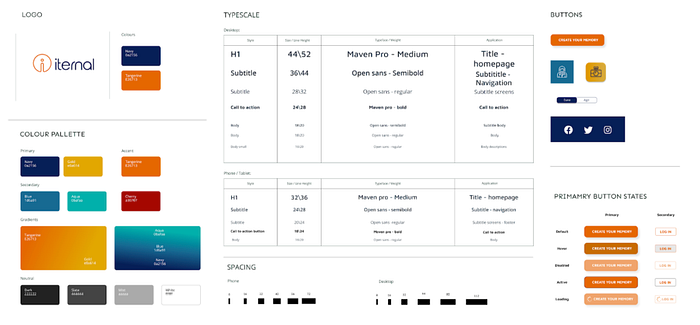
We also created a Design System largely based on Iternal’s current branding, but also reflecting these new accessibility guidelines.
Final designs
The final designs were tested with 10 users, and was presented to our client. Below is a video of the demo in mobile view:
Final Thoughts
Next Steps
Next, I would like to build out the features of the dashboard, which I think if designed well, would keep users coming back and using the site. More user research and testing would be valuable in this. In addition, the timeline functionality is what our users really resonated with. I would like to expand this functionality further, perhaps by adding commenting or like features, or allowing users to further categorise their memories in a way that suits them.
Client Feedback
We had great feedback from the client team after our final presentation, which was amazing to hear! The client, one of the co-founders of Iternal, commented at the end of the presentation:
“I am blown away…you guys have fully understood what we are doing, who we want to talk to and what we want to achieve.”
“Your designs are approachable, professional and friendly, with clear rationale and a lot of attention to detail…Thank you, it’s incredible!”
— Paul, Iternal Co-Founder
Their lead developer said:
“This is great! I can’t wait to build it, you guys have done a fantastic job.” — Stefan, Lead Developer
IN FACT, they did, within a week! You can see it here on their shiny new website.
The Results
Iternal have seen the conversion rate from the homepage to the sign up page rise considerably.
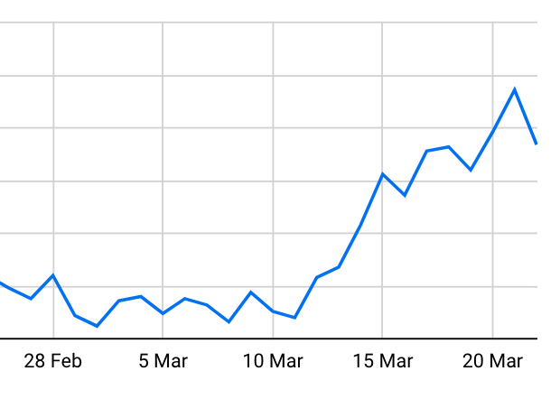
Here’s traffic to the sign up page over the month after implementation. An awesome achievement! The client mentioned “results are awesome with Sunday just gone (21st March) being our best day ever for sign ups.”
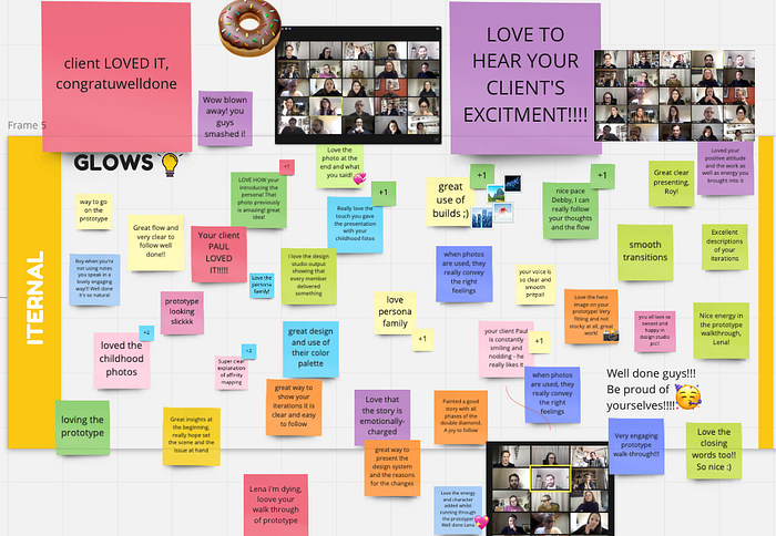
Feedback from the class:
What I have learnt
My biggest learning from this project was balancing both user and business needs. In the brief, Iternal wanted us to explore how to make the user create their first memory without signing up, however this frustrated our users when tested. When we shared this, we were lucky that Iternal were open to exploring other user journeys. They really understood the value of advocating for the user, which was great!
Collaborating with my team on this project was fantastic! It was valuable to work together to design a solution which balances business needs and the user experience.
Iternal implemented changes to the homepage within a week, and plan to make the additional changes in the future. This was a fantastic outcome for my first live UX project. You can check it out at iternal.life!
Yay! You made it to the end! Thank you so much for reading.
If you would like to see other UX projects that I have worked on you can take a look at my other Case Studies on Medium, or check out my Portfolio. Alternatively, if you’d like to discuss future work or simply say hi, please feel free to connect on LinkedIn.

